


Designing for delight: How nicer spaces make nicer people
- Staff Writer
- Jun 26, 2025
- 5 min read

We’ve tracked the effect of dopamine everywhere lately, on our screens, in our workouts, even in our wellness routines. Now it’s turning up in interiors. Dopamine décor is the container concept for a wave of visually upbeat design: saturated colour, soft shapes, tactile excess, and a whiff of nostalgia. It’s less a style than it is a shift in emotional tone. Feelings, specifically good ones, are back on the design brief.
The Science of Sensation
Our environments have a profound impact on how we feel and behave. The emerging field of neuroarchitecture is helping put language to what designers have long understood intuitively. The brain responds with remarkable sensitivity to light, proportion, texture, and spatial rhythm. Research into the medial orbitofrontal cortex has shown that beauty is not simply decorative. When we experience beauty in art or design, the brain’s reward center (linked to dopamine release) lights up, similar to when we’re in love. In other words, a visually pleasing space can literally be rewarding to the brain. This can translate to real behavioural effects: a beautiful, engaging environment makes us want to linger longer, return more often, and even prefer those spaces over others.
The look and feel of spaces or products are central to human experience. Recent studies have even shown that people report greater happiness in more scenic, attractive environments. Not just in nature, but also in well-designed towns and city spaces. Environments can influence our mood, motivation, and social mindset. So, by intentionally using colour to create aesthetically uplifting surroundings, we are able to enhance emotional well-being, regulate mood, and guide behaviour. In other words, nicer spaces help make nicer people.
Dopamine Décor in Interior Design

“Dopamine décor” has evolved as a feel-good antidote to years of drab minimalism. This trend, born out of the “dopamine dressing” fashion movement, encourages people to decorate their homes in ways that make them happy on a deeply personal level, rather than following neutral magazine norms (think Iris Apfel). The result is a resurgence of bold colours, eclectic patterns, and nostalgic touches in interiors. Brilliantly bright palettes and playful design elements are the hallmark of dopamine décor. Interior designer Saniya Kantawala describes it as being “all about vivid colours, clashing patterns, maximalism and pure happiness” – in other words, going all-out with visually stimulating elements that spark joy, yet still tying them together with a sense of aesthetic harmony. Joyce Huston, a lead designer and early adopter of the trend, notes that after years of safe neutrals, “people are yearning for spaces that are more vibrant and emotionally uplifting” – essentially homes that reflect individual joy and personality rather than generic “good taste”.
Colour, Pattern, and the Architecture of Memory

Dopamine décor borrows widely. The mid-20th century Mexican architect Luis Barragán famously championed “emotional architecture”. He said he designed with the explicit function of producing emotion. Barragán’s buildings, from private chapels to modernist homes, are celebrated for their masterful use of vividly coloured walls (hot pinks, golden yellows, purples) combined with calm reflecting pools and dappled natural light. These elements work in concert to encourage visitors to slow down, meditate, and reflect – essentially using colour to elevate the spirit and invite contemplation. Barragán proved that even a minimalist space can feel warm and poetic with the right hues; in his hands, a wall painted deep rose or brilliant orange wasn’t mere ornamentation but a source of emotional resonance, evoking feelings of solitude, joy, or introspection in the occupant.
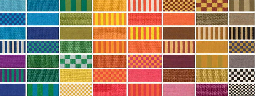
Like Barragán, the more humanist expressions of Midcentury Modernism have a strong influence on the trend. At Herman Miller, Alexander Girard treated colour and pattern as emotional architecture. His work at La Fonda del Sol was not just decorative—it was cultural storytelling. It is memory. Avocado green, bubblegum pink, tomato red—each one comes with an emotional payload. Checkerboards, scalloped tiles, mushroom lamps—they don’t just recall eras. They recall feelings. Designers like Lucienne Day, Marimekko, and Jack Lenor Larsen carried that spirit forward. Their work made the case for joy as a serious design value.
In recent years, we’ve seen a revival of the 1980s Memphis design aesthetic which gave designers permission to be unserious with conviction. This nostalgia-driven trend banks on the idea that bold, quirky colours make people happy and stand out in an Instagram feed. Retail brands like IKEA have periodically introduced limited collections of vividly coloured homeware to energise consumers.
But Dopamine décor has glamour too. Hollywood Regency offers contrast and drama. Dorothy Draper’s grand gestures feel at home in rooms that flirt with spectacle. Japanese kawaii adds rounded charm and pastel innocence. Indian maximalism contributes its focus on a long tradition of pattern and craftsmanship. Even the chromed curves of early 2000s design have re-emerged ironically.
Public Spaces with Private Intimacy

Hospitality has embraced the movement with flair. In Paris, Le Grand Mazarin, designed by Martin Brudnizki, offers a study in chromatic delight. There are green silk ceilings, leopard print trims, and scalloped velvet finishes that feel as theatrical as they are thoughtful.
In Cape Town, Gorgeous George finds its own rhythm. Afro-eclectic textiles sit alongside concrete surfaces and tropical foliage, framed within an Art Deco shell. The result is a space that feels emotionally intelligent. It speaks local, without speaking loudly.
And then there is EL&N in London, where dopamine design steps into its most commercial stride. Known for its sugar-pink interiors, cascading florals, and colour-drenched patisserie displays, the café chain has built a brand around curated joy. It is part Instagram theatre, part sensory retreat, proving that emotional aesthetics can also be a viable business model.
Emotionally Intelligent Interiors
Dopamine Design across product, interior, and architectural fields shows us that our surroundings can be intentionally crafted to bring out the best in us – to make us feel happier, more comforted, and more socially open. Colour choices are central to this, as they can excite or soothe our neural pathways in an instant. The overarching lesson is that aesthetics are not frivolous; they deeply affect our psyche. An aesthetically pleasing environment that delights the eyes and senses contributes to improved emotional well-being, which in turn can translate to more positive interactions (indeed, a growing body of evidence suggests that beautiful, joyful spaces encourage people to be kinder and more cooperative). Designers and architects increasingly recognise this responsibility. As one neuroarchitecture commentator put it, design isn’t just about superficial looks; it has a “profound impact on human experience, behaviour and well-being”.


Comments